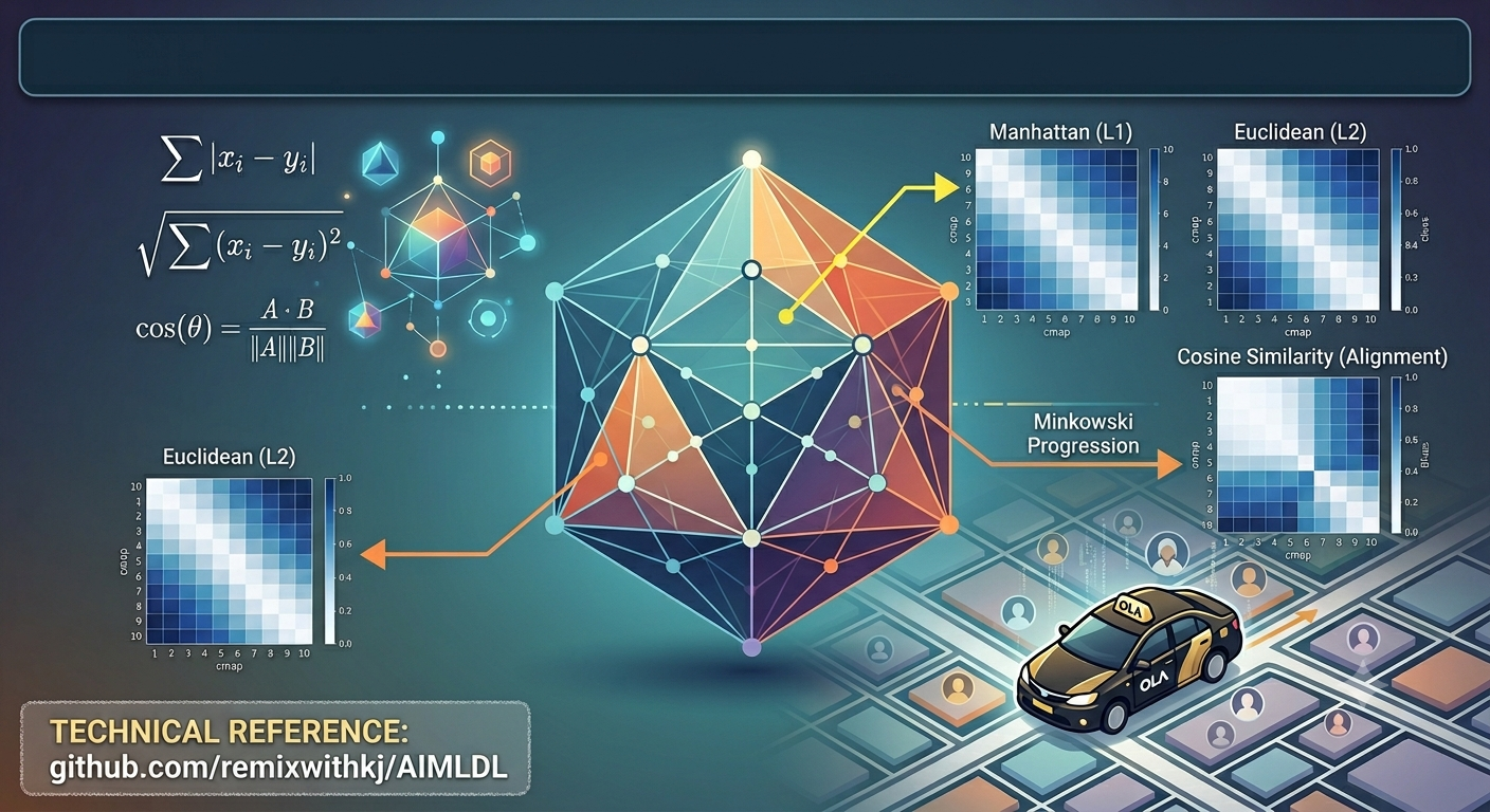
In Part 1, we measured distance the way a ruler does. In Part 2, we taught the ruler about the shape of data: variables that move together, and populations that drift.
But every metric so far has assumed one thing quietly: that the numbers sit on a flat sheet of graph paper. Location data doesn’t. Latitude and longitude are angles on a round planet, and a degree east in Bengaluru is not the same size as a degree east in London.
That matters more often than you’d think:
- Which customers live within 5 km of a store?
- Which dealer is nearest to a new lead?
- Is a card used in two cities ten minutes apart plausible, or fraud?
In Part 3, we shall start with Haversine distance: the straight line “as the crow flies”, measured on the Earth instead of on a map. Then we turn to data that isn’t numeric at all: Jaccard, Sørensen–Dice and Hamming.
A quick recap of the plan.
- Part 1 (published): continuous and angular metrics
- Part 2 (published): shape-aware metrics: Mahalanobis, KL divergence and Bhattacharyya
- Part 3 (this post): metrics for places and for things that aren’t numbers: Haversine, Jaccard, Sørensen–Dice and Hamming
The dataset. The OLA data records pickup and drop points only as area codes (Area-1 to Area-50), with no coordinates. So for Haversine, I built a small companion dataset: 30 well-known Bengaluru places, from the airport to Nandi Hills, with their latitude and longitude.
Two trips, one map, one problem
Why do we need a new metric like Haversine, when we already have so many?
Because it answers a very different question. Euclidean and Manhattan were built for flat graph paper; Haversine was built for a round planet.

Take two airport taxi rides of similar length, measured as the crow flies:
- Bengaluru: MG Road Metro to Kempegowda Airport is 27 km
- London: Heathrow Airport to Central London is 23 km
Now do what most first attempts at location data do: treat latitude and longitude as plain x and y numbers, apply Euclidean distance from Part 1, and convert degrees to kilometres at 111 km per degree.

The same formula is almost perfect in Bengaluru and wildly wrong in London. The trips are about the same length. What differs is where on the planet they are.
The reason is that degrees are not all the same size. A degree of longitude in London is about 69 km, not 111 km. Raw-degree Euclidean doesn’t know that, so every step east or west in London is stretched by 60%.
That is the idea behind the first half of this post: on a round planet, the ruler has to know where it is standing.
Distance Metric: Haversine – the great-circle metric
Context: Latitude and longitude are angles, measured from the centre of the Earth. The shortest path between two places follows the curved surface along a great circle, the route long-haul flights take. Haversine distance computes the length of that path, assuming the Earth is a sphere. Its name comes from the haversine function, hav(θ) = sin²(θ/2), which navigators used in printed tables long before calculators.
Why degrees can’t be used as they are.
- One degree of latitude (north–south) is always about 111 km.
- One degree of longitude (east–west) shrinks as you move away from the equator, because the lines of longitude meet at the poles: 1° of longitude = 111 km × cos(latitude).


Every line of latitude is a circle around the Earth, and every circle is split into 360 degrees of longitude. Near the equator that circle is the full width of the planet, so each degree is about 111 km. Move north and the circle gets smaller, but it still has 360 degrees, so each degree covers less ground: 108 km in Bengaluru, 69 km in London, and nothing at all at the pole, where the circle shrinks to a point. Degrees of latitude don’t shrink, because every north–south line runs the full height of the globe.
The distance between two points (φ₁, λ₁) and (φ₂, λ₂) is:
Here φ is latitude and λ is longitude, both in radians, and R is the Earth’s radius, about 6,371 km. The first term is the north–south gap. The second is the east–west gap, shrunk by cos φ₁ × cos φ₂: that is the “degrees shrink” correction, built into the formula. The arcsin turns the result into an angle at the Earth’s centre, and multiplying by R turns the angle into kilometres.
Worked example: MG Road Metro to Kempegowda Airport. MG Road is at (12.9755°N, 77.6067°E) and the airport at (13.1986°N, 77.7066°E).

The drive is longer, of course: roads aren’t crow flights. Haversine tells you the straight line over the Earth, not the route.
Raw degrees vs latitude-corrected: where the error comes from
There is a middle path between raw degrees and Haversine: convert each gap to kilometres with the right scale first, then apply Pythagoras on a flat map. Call it flat Euclidean, latitude-corrected.
Here Δφ and Δλ are in degrees and φ̄ is the average latitude of the two points. Raw-degree Euclidean is the same formula without the cos φ̄.
Worked example: Heathrow (51.4700°N, 0.4543°W) to Central London (51.5074°N, 0.1278°W). The gaps are Δφ = 0.0374° and Δλ = 0.3265°, at an average latitude of 51.49°, where cos φ̄ = 0.62.

The north–south part is identical. The whole error sits in the east–west part, where raw degrees use 111 km instead of London’s 69 km.
Why the corrected version lands so close to Haversine. There are two separate errors in play:
- The scale error: unequal degrees. This is the big one, and cos φ̄ fixes it. It is the only difference between the two Euclidean versions.
- The curvature error: a flat map of a curved surface. The corrected version still pretends the ground is flat. Over a city or even a country, the Earth is so close to flat that this barely matters, like a bathroom tile on a football. Over thousands of kilometres the surface really curves, and one average latitude can’t describe a route whose longitude scale keeps changing.
Raw degrees get both wrong. The corrected version fixes the big one and leaves only curvature, which is tiny for short trips. Haversine handles both, at any distance.
Real trips, three methods. Haversine is the truth; each other column shows how far a shortcut lands from it.

Three things stand out:
- Curvature hardly matters below about 1,000 km. The corrected column stays at 0% until trips reach flight scale.
- Raw degrees go wrong by location, not distance. Bengaluru, near the equator, gets away with it. London is 59% out on a 23 km taxi ride.
- Bengaluru → Delhi shows 0% everywhere. The route runs almost due north, so longitude barely changes and the mistake has nothing to act on.
Fun fact: One degree of latitude (north–south) is always about 111 km, anywhere on Earth. One degree of longitude (east–west) depends on where you are, because the lines of longitude meet at the poles:

The rule is: 1° of longitude = 111 km × cos(latitude).
When to switch to Haversine

The one-line rule: if your data is latitude and longitude, use Haversine. The threshold isn’t really a distance. It is the moment you stop converting degrees to kilometres properly.
Applications:

Challenges:
- It assumes a perfect sphere. The Earth is slightly flattened at the poles, so Haversine can be off by up to about 0.5%. But it wouldn’t matter in most practical application except when doing extreme precision work like dropping a laser guided tracer over 1000 kms.
- It measures the crow’s flight, not the route. Roads, rivers, flyovers and one-way streets add distance. Silk Board Junction at 6 PM is much farther than its Haversine distance suggests.
- It needs coordinates. Area codes, PIN codes or zone names need geocoding first, as our OLA data does.
Representation/resources: London to New York, drawn two ways. On a flat map the great-circle route bends north and looks like a detour; on the globe it is the shortcut, and the map’s “straight” line is the one that bends.

Code level implementation
The notebook works on the 30 Bengaluru landmarks and shows five ways to use Haversine, from a full distance table to clustering.
Variant 1: every place to every other place. scikit-learn’s haversine_distances takes [latitude, longitude] in radians and returns angles, so we multiply by the Earth’s radius to get kilometres. A colour gradient turns the table into a heatmap.

Variant 2: distance between two chosen places.
Variant 3: the k nearest neighbours. A BallTree with the Haversine metric finds the closest places without comparing every pair. Here k = 2: the place itself, plus its nearest neighbour.
Nearest 2 Neighbors Result for Kempegowda International Airport:
- Kempegowda International Airport (Index 0): 0.00 km
- Yelahanka New Town (Index 27): 16.16 km
Variant 4: everything within a radius. The same tree answers “what is within 20 km of the airport?” The radius has to be in radians too, so we divide the kilometres by R.
Places within 20.0 km of ‘Kempegowda International Airport’:
- Kempegowda International Airport (Index 0)
- Nandi Hills (Index 13)
- Manyata Tech Park (Index 16)
- Yelahanka New Town (Index 27)
Variant 5: clustering places into zones with DBSCAN. DBSCAN needs two settings: eps, the radius (in radians, so 1.5 km ÷ R), and min_samples, how many places must fall inside it to form a cluster. Places that don’t belong to any cluster get the label −1.
cluster_label
-1 27
0 3
Only one zone is dense enough: three places within 1.5 km of each other.

MG Road, Vidhana Soudha and Cubbon Park: the heart of the city, exactly where the heatmap was palest. Widen eps to 3 km and DBSCAN finds two zones instead: a central-north zone of 10 places (Majestic, Yeshwanthpur, MG Road, Vidhana Soudha, Cubbon Park, Lalbagh, Bangalore Palace, Malleshwaram, Rajajinagar and IISc) and a south zone of 6 (Silk Board, Forum Mall, Jayanagar, HSR Layout, BTM Layout and Banashankari). The radius you choose decides what counts as a neighbourhood.
Which library to use?

Reality check on the Bengaluru places
Across all 435 pairs of the 30 places, raw-degree Euclidean overstates the true distance by 0.9% at the median and 2.6% at most. The latitude-corrected version stays within 0.0001%.
That is the honest finding for Bengaluru: near the equator and within one city, the flat shortcut is nearly harmless. The closest pair is Vidhana Soudha and Cubbon Park (0.45 km); the farthest is Wonderla and Nandi Hills (67 km). Haversine matters here for being right, not for rescuing a broken answer. The moment the same code runs on Delhi, London or a national dealer network, it becomes essential.
The dataset and the annotated codebook will be on Kaggle and GitHub.
From places to things that aren’t numbers
Distance Metric: Jaccard – the overlap of two sets
Context: Many things we know about customers aren’t measurements. They are sets: the promo codes a rider has redeemed, the cuisines someone orders, the products in a basket, the pages a visitor read. You can’t subtract one promo code from another. You can only ask which ones two customers share. Jaccard similarity turns that question into a number: of everything either customer has, what share do they both have?
For two sets A and B:
d_J(A, B) = 1 – J(A, B)
The top line, A ∩ B (the intersection), counts the items both customers have. The bottom line, A ∪ B (the union), counts the items either of them has, each counted once. J runs from 0 (nothing in common) to 1 (identical sets), and the Jaccard distance is simply 1 − J.
Worked example: two riders’ promo codes. Customer A has redeemed four codes and Customer B three.

The same example as a Venn diagram: Jaccard is the overlap divided by everything inside either circle.

They share two of the five codes between them, so they are 40% alike. That is a fair summary: both are weekend and rainy-day riders, but only A flies, and only B rides late.
Why “neither used it” doesn’t count
This is the heart of Jaccard. Write each customer as a row of 1s and 0s, one column per promo code, and count four kinds of column: both used it (M11), only A (M10), only B (M01), and neither (M00). Jaccard uses the first three and leaves M00 out:
The older simple matching coefficient counts M00 as agreement too. Here is why that goes wrong. Say the app offers 20 codes, and A and B each used three, with one in common:

Simple matching calls them 80% alike, almost entirely because of the 15 codes neither of them touched. Not using the same code tells you nothing about two people; using the same code does. Most business data looks like this: a few 1s in a long row of 0s. Baskets, tags, offers, clicks. That is exactly where Jaccard earns its place.
Order and repeats don’t count either
- Repeats don’t count. Ten UPI rides and one cash ride give the set {UPI, Cash}, the same as one of each. Jaccard sees what a customer used, not how often.
- Order doen’t matter. Auto → Mini → Auto and Mini → Auto → Auto are both {Auto, Mini}, so Jaccard calls them identical. When the sequence matters, use Hamming (below).
Fun fact: The formula comes from botany, not business. In 1901 the Swiss botanist Paul Jaccard compared the plant species growing in different districts of the Alps and called the share they had in common the coefficient de communauté. Chemists rediscovered the same idea decades later as the Tanimoto coefficient, still the standard way to compare molecules for drug discovery.
When to use Jaccard

The one-line rule: if your data is a list of things a customer has or hasn’t done, use Jaccard. If it is a measurement, such as a fare, a distance or a rating, go back to Euclidean or Mahalanobis. Plain Jaccard can’t tell ₹450 from ₹460: to it they are simply different.
Applications:

Fun fact: Jaccard distance is a true metric. The distance form, 1 − J, obeys all three laws of a metric (similarity itself doesn’t, because it is highest when two things are closest):
- Discernibility: the distance is 0 only when the two sets are identical (count two empty sets as 0).
- Symmetry: overlap and union read the same whichever customer comes first.
- Triangle inequality: d(A, C) ≤ d(A, B) + d(B, C). Not obvious, but proved in 1971 by Levandowsky and Winter. Reader to explore on his own.
Challenges:
- Set size skews it. A customer with 2 codes and one with 40 score low even when the 2 sit inside the 40. If the real question is “is A’s taste part of B’s?”, the overlap coefficient, |A ∩ B| ÷ the smaller set, answers it better. Sørensen–Dice, next, softens the effect a little.
- It is yes or no. One airport trip counts the same as thirty. When amounts matter, weighted Jaccard (sum of the smaller values ÷ sum of the larger values) keeps the counts.
- Tiny sets give blunt answers. Most riders in our OLA data have only one to three bookings, so their sets of pickup areas or payment methods are tiny and Jaccard is often exactly 0 or 1. It shines with richer histories.
- Two empty sets are 0 ÷ 0. Decide upfront whether two customers with no history count as identical or as unknown.
Distance Metric: Sørensen–Dice – overlap that counts twice
Why another overlap score, if we already have Jaccard?
Fair question. Both look at the same thing, the codes two customers share. In fact, if all you do is rank a customer’s nearest lookalikes, they put the neighbours in exactly the same order. So why does Dice exist, and why is it everywhere from hospitals to search engines?
- It scores partial overlap more generously. Jaccard divides the overlap by everything either customer has. Dice compares it with the average size of the two sets. Two customers who share half their codes look 50% alike to Dice but only 33% alike to Jaccard. When people set thresholds by feel (“anything above 0.5 is a match”), Dice’s scale reads closer to intuition.
- It is the F1 score in disguise. Treat one set as the truth and the other as a prediction, and Dice equals F1, the standard balance of precision and recall. Anyone grading a model, from tumour outlines in medical scans to fields pulled from invoices, already speaks Dice.
- It forgives small differences in text. Split two names into pairs of letters and Dice tolerates typos better: “Koramangala” vs “Kormangala” scores 0.84, where Jaccard gives 0.73. That is why record-matching tools reach for it.
The catch, covered in the fun fact above: Dice is not a true metric. Use Jaccard when an algorithm needs a real distance.
Context: Two ecologists invented the same score independently: Lee Dice in the United States in 1945 and Thorvald Sørensen in Denmark in 1948, both comparing which species turned up in different habitats. Where Jaccard asks “what share of everything is shared?”, Sørensen–Dice asks “how big is the overlap compared with the two sets on average?”
For two sets A and B:
d_{DSC}(A, B) = 1 – DSC(A, B)
The top line counts the shared items twice, once for each customer. The bottom line adds up the two set sizes, so the shared items are counted twice there too, once in each set. Like Jaccard, it runs from 0 (nothing in common) to 1 (identical sets).
Worked example: the same two riders. Same promo codes as before, so we can compare the two scores directly.

The same example as a Venn diagram: the overlap is counted in both circles.

Same riders, same shared codes: Jaccard says 0.40, Dice says 0.57. Neither is wrong. They measure the same overlap on different scales.
Same order, different scale
Dice and Jaccard can be converted into each other exactly:
So whenever Jaccard goes up, Dice goes up too, and the ranking of lookalikes never changes. What changes is the number, and Dice is always at least as high as Jaccard:

The gap is widest for middling overlaps and vanishes at the extremes. That is the practical risk: a threshold of 0.5 means something quite different on each scale. 0.5 Dice is only 0.33 Jaccard.
Fun fact: If you have ever read a model report with an F1 score, you have read a Dice score. Put the true items in one set and the predicted items in the other: the overlap is the true positives, and 2 × overlap ÷ (true + predicted) is exactly F1. Medical imaging teams even train their models to maximise it directly, using “Dice loss”.
When to use Sørensen–Dice

The one-line rule: use Dice when you are grading a match, and Jaccard when you need a distance.
Applications:

Challenges:
- It is not a true metric. Dice breaks the triangle inequality (see the fun fact in the Jaccard section), so algorithms and search indexes that assume a real distance can misbehave. Convert to Jaccard first.
- Its generosity can mislead. A Dice of 0.57 sounds like a majority match; the riders actually share 2 of 5 codes. Say which scale a score is on.
- It inherits Jaccard’s blind spots. Still yes or no (counts ignored), still no order, still skewed by very uneven set sizes, and still 0 ÷ 0 for two empty sets.
- Tiny sets stay blunt. With one to three bookings per OLA rider, Dice, like Jaccard, is often exactly 0 or 1.
Distance Metric: Hamming – how many positions differ
Why Hamming, if we already have Jaccard and Sørensen–Dice?
Jaccard and Dice compare bags of things: what a customer has, ignoring when and in which slot. A lot of business data isn’t a bag. It is a row of slots, each with its own meaning:
- When order is the story. A rider’s last five bookings, the steps of a checkout funnel, a monthly pattern of on-time and late payments. Shuffle them and the meaning changes, but Jaccard and Dice wouldn’t notice.
- When each slot is a field. A customer profile of vehicle type, payment method, pickup area and time slot is not a set: “Cash” only means something in the payment slot. Hamming asks, field by field, “same or different?”
- When “no” is real information. In a fixed checklist (KYC done? app installed? card on file?), both customers saying “no” is genuine agreement. Jaccard throws that away; Hamming counts it.
In short: Jaccard and Dice compare what customers have. Hamming compares how they line up.
Context: Richard Hamming invented it at Bell Labs in the late 1940s. His weekend jobs on the lab’s relay computers kept stopping whenever the machine detected an error, losing the whole run. He reasoned that if a machine can detect an error, it should be able to find and fix it, and in 1950 he published codes that do exactly that. To measure how far apart two codes are, he simply counted the positions where they differ.
For two sequences x and y of the same length n:
The first line counts the positions where the two sequences disagree: each mismatch adds 1, each match adds 0. Dividing by n turns that count into a share between 0 (identical) and 1 (different in every position), so profiles of different lengths can be compared. Similarity is 1 minus the normalised distance.
Worked example: two riders’ last five bookings.

The same example, lined up slot by slot: Hamming only ever compares the two tiles in the same column.

Jaccard looks at the same rides and says 0.75 alike: both riders use Auto, Mini and Prime Sedan. Hamming says only 0.40: they rarely book the same thing at the same point in their history. Both are right; they answer different questions.
Every position counts, including shared “no”s
Run Hamming on the 20-promo-code example from the Jaccard section, with each code as a yes/no slot:

On yes/no data, normalised Hamming is exactly the simple matching coefficient from the Jaccard section, flipped into a distance. That is a strength for fixed checklists and a weakness for sparse baskets. Pick by asking one question: does “neither has it” tell me something about these two customers? If yes, Hamming. If no, Jaccard or Dice.
Fun fact: Hamming distance is a true metric: zero only for identical sequences, the same in both directions, and it obeys the triangle inequality (to turn x into z, you never need more changes than going via y). It is also one of the fastest distances a computer can calculate: for binary codes, a single XOR followed by a bit count. That speed is why photo apps compare 64-bit image hashes with Hamming to spot near-duplicate pictures among millions.
When to use Hamming

The one-line rule: if the slot matters as much as the value, use Hamming.
Applications:

Challenges:
- Same length only. Both sequences need the same number of slots. A rider with 3 bookings can’t be compared with one who has 5 without padding or trimming.
- One extra step shifts everything. If Rider B simply took one extra Bike ride before the same four rides as A, every position would differ and Hamming would call them completely different. Edit distance (Levenshtein), which allows insertions and deletions, handles this better.
- All mismatches cost the same. Auto vs Mini counts the same as Auto vs Prime SUV, and “Area-1” vs “Area-2” the same as “Area-1” vs “Area-50”, even when some differences are clearly bigger.
- Shared absences count. Right for checklists, wrong for sparse data: two riders who skipped the same 95 promo codes look 95% alike.
Code level implementation
Back to the OLA rides. To compare customers by what they use, we turn each customer into a row of yes/no flags: which vehicle types they have booked and which payment methods they have used.
Step 1: Keep the categorical columns. Each row of the OLA data is one booking, so a customer with three rides appears three times.
Step 2: Pick 10 customers with at least two bookings. Most riders in the data have booked only once, and a one-item set can only match another completely or not at all. Customers with two or more bookings give the metrics something to work with.
Step 3: Pivot to one row per customer. Vehicle types first, then payment methods; 1 means the customer used it at least once.

Step 4: All three metrics in one go. scikit-learn’s pairwise_distances returns distances, so similarity is 1 minus the result.
Step 5: Distance and similarity side by side. A small helper puts two tables next to each other, so each pair can be read both ways.


What the three tables tell us:
- The same lookalikes come out on top. Customers 389033 and 476821 both ride Auto and Prime SUV and both pay by card; the only difference is that one also uses UPI and the other Wallet. They are among the closest pairs on all three metrics: Jaccard 0.60, Dice 0.75, Hamming 0.82. Pairs 295818–602613 and 295818–802774 tie with them.
- Dice is always at least as high as Jaccard. Same overlap, more generous scale: every 0.60 Jaccard is 0.75 Dice, every 0.40 is 0.57.
- Hamming never says “nothing in common”. Customers 544045 and 919857 share no vehicle and no payment method, so Jaccard and Dice both give 0. Hamming still calls them 0.55 alike, because both didn’t use six of the same eleven options. That is the shared-“no” effect from the Hamming section, live on real data. The lowest Hamming similarity in the whole table is 0.27.
Which one is right depends on the question. To find riders who use the same things, Jaccard or Dice. To compare complete yes/no profiles where “didn’t use it” matters too, Hamming.
Takeaways – which metric for which business question?

Lessons from Part 3 so far:
- Degrees are not kilometres. A degree of longitude shrinks from 111 km at the equator to 69 km in London. Convert properly, or let Haversine do it.
- The error depends on where you stand, not how far you go. Raw degrees are nearly harmless in Bengaluru and 59% out on a London taxi ride.
- Curvature only bites at flight scale. Below about 1,000 km, a properly converted flat distance agrees with Haversine to within 0.2%.
- The crow is not the cab. Haversine is the straight line over the Earth. Manhattan is the grid. The road is neither.
Coming up
That closes the Notions of Distance series. Three parts, one question asked in different ways: how alike are two things?
- Part 1 measured customers as numbers: Euclidean, Manhattan, Chebyshev, Minkowski, Cosine and Canberra.
- Part 2 looked at the shape of the data: Mahalanobis for correlated features, KL divergence and Bhattacharyya for whole distributions.
- Part 3 left the spreadsheet: Haversine for places on a round Earth, Jaccard and Sørensen–Dice for what customers have, and Hamming for how they line up.
The common thread: there is no single “right” distance. The right one is the one that matches the question the business is asking.
Next up: Market Basket Analysis. Jaccard asked which customers share the same items. Market basket analysis flips the question: which items keep turning up in the same baskets? For a business with a thousand SKUs or more, that question sits behind cross-selling, store layout, bundle pricing, promotions and even inventory planning. No category manager can eyeball half a million possible product pairs; association rules (support, confidence and lift) find the handful that matter. The next series starts there.
The annotated codebook will be available at https://github.com/remixwithkj/AIMLDL/tree/main/distance-similarity-metrics
Leave a Reply